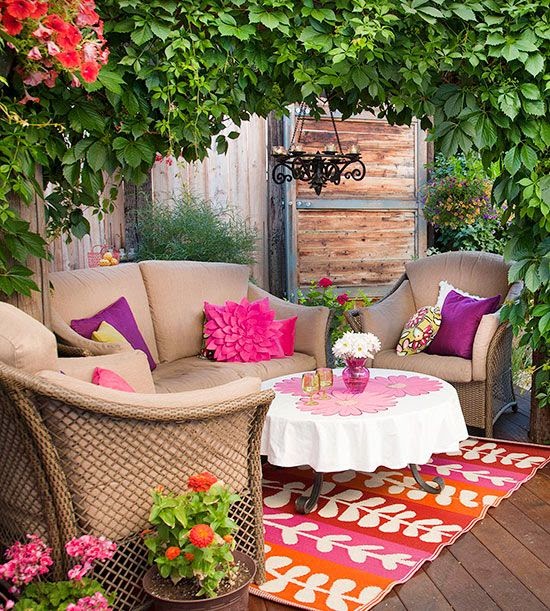
So, I have a confession to make....I have been craving Pink. For weeks now.
 I know with Breast Cancer Awareness Month this October my heart and mind have been on my extraordinary friends, and their mothers, daughters, sisters, aunts and nieces who redefine bravery for all of us on a daily basis.
What is this color that stands as the visual image of their battle, their triumph, and their strength? And is it possible for us to need a color in our lives to represent our being? Our own personal battles and triumphs? Just a little something to put in our pocket as a reminder that, "We can".
 |
| Photo credit Apartment Therapy |
As it turns our Pink is the perfect companion.
A combination of the take action primary of Red and the potential for achieving success and focus of White, it's no surprise that pink allows us to see our path and helps us to set on it's journey as well.
Pink is tender and affectionate, romantic and playful. The hotter the color the hotter the passion.
 |
| Benjamin Moore's Smashing Pink |
Oddly enough it is heavily associated with the feminine, unlike blue. Yet, it is the easiest tone on the skin and marries well with almost every complexion. And while it's perfectly at home standing on it's own, Pink is comfortable with almost any other color from grays, to browns, black, greens and it's standby favorite~orange.
So, if this color is so universally helpful and filled with feel good attributes, why then is it one of the least used colors in design? Some of it is the strong feminine connotations (which might be all the more reason to inject it into all situations), to the mystery of how to make it work.
Here's a guide to slipping this guaranteed smile making color into your daily life.
Warning: Small doses of this intoxicating pigment could lead to long term or permanent inclusion into one's closet, home and office. Use at your own risk...
~How about getting stoned.
 Rose Quartz is the stone of the heart, acceptance and unconditional love. Pop one in your pocket or set out a glass jar filled with these beauties to remind yourself that you are loved and give that gift freely.
 |
| photo credit from Better Homes and Gardens |
Whether a hint of pink or all out fuschia this color will catch the eye and warm the soul. When the eye sees something that pleases it the dilation sends all sorts of feel good chemicals to the brain.
Pink clothing makes everyone look good, regardless of the skin tone.
~ Take a seat.
There is something just imagination provoking about a pink chair or chaise. A spot for a romantic read or magical storybook at bedtime. Most any fabric will do. And pink is very forgiving about DIY projects, so feel free to reuse an old Louis chair or metal barstool and practice your spray painting skills. Add a fabulous fabric and you are well on your way to abandon bliss.
 | |
| Photo from Notonthehighstreet.com |
 |
| Photo Credit from Apartment Therapy |
~Advanced therapy.
My second confession is that I have always yearned for an orange and pink dining room. I am hopeful, but practical. Dining rooms, powder rooms, and bedrooms are all willing subjects for a bold palette. Start with one wall and see where your imagination takes you.
 |
| photo credit from Interior Design Pro |
 | |
| Photo credit from Domainehome.com |
And if you are game for the above mentioned dining room, call me.....I'm waiting.
I always tell my kids if it's not immoral, illegal, or socially irresponsible, try to say, "Yes".
So goes it with Pink, I think.
Happy Decorating!
Best,
Renee
For more design inspiration, check out my pinterest board this week...


.png)


.png)


.png)

.png)
.png)
.png)