Showing posts with label Sherwin Williams. Show all posts

Tuesday, October 14, 2014

Color Cravings ~ Think Pink


So, I have a confession to make....I have been craving Pink. For weeks now.

http://ladoole.tumblr.com/I know with Breast Cancer Awareness Month this October my heart and mind have been on my extraordinary friends, and their mothers, daughters, sisters, aunts and nieces who redefine bravery for all of us on a daily basis. 

What is this color that stands as the visual image of their battle, their triumph, and their strength? And is it possible for us to need a color in our lives to represent our being? Our own personal battles and triumphs? Just a little something to put in our pocket as a reminder that, "We can".

 Photo credit Apartment Therapy

As it turns our Pink is the perfect companion.

A combination of the take action primary of Red and the potential for achieving success and focus of White, it's no surprise that pink allows us to see our path and helps us to set on it's journey  as well.

Pink is tender and affectionate, romantic and playful. The hotter the color the hotter the passion. 


Benjamin Moore's Smashing Pink
And pink is the color of hope. Warm and comforting, it gives us the sense that there is in fact a tomorrow. Pink is used in rooms to help calm aggression and bring a sense of peace and tranquility to a space.

Oddly enough it is heavily associated with the feminine, unlike blue. Yet, it is the easiest tone on the skin and marries well with almost every complexion. And while it's perfectly at home standing on it's own, Pink is comfortable with almost any other color from grays, to browns, black, greens and it's standby favorite~orange.


So, if this color is so universally helpful and filled with feel good attributes, why then is it one of the least used colors in design? Some of it is the strong feminine connotations (which might be all the more reason to inject it into all situations), to the mystery of how to make it work.

Here's a guide to slipping this guaranteed smile making color into your daily life. 

Warning: Small doses of this intoxicating pigment could lead to long term or permanent inclusion into one's closet, home and office. Use at your own risk...

~How about getting stoned.
Rose Quartz is the stone of the heart, acceptance and unconditional love. Pop one in your pocket or set out a glass jar filled with these beauties to remind yourself that you are loved and give that gift freely.
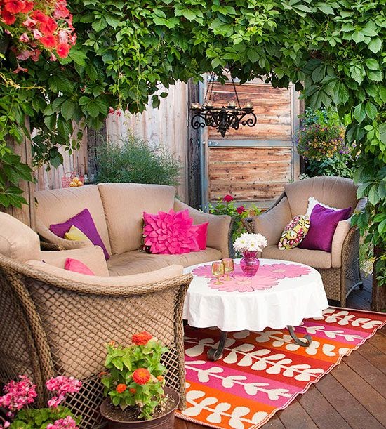


photo credit from Better Homes and Gardens
~Accessories with attitude.
 Whether a hint of pink or all out fuschia this color will catch the eye and warm the soul. When the eye sees something that pleases it the dilation sends all sorts of feel good chemicals to the brain. 
Pink clothing makes everyone look good, regardless of the skin tone. 


~ Take a seat. 
There is something just imagination provoking about a pink chair or chaise. A spot for a romantic read or magical storybook at bedtime.  Most any fabric will do. And pink is very forgiving about DIY projects, so feel free to reuse an old Louis chair or metal barstool and practice your spray painting skills. Add a fabulous fabric and you are well on your way to abandon bliss.

Photo from Notonthehighstreet.com

Photo Credit from Apartment Therapy


~Advanced therapy. 
My second confession is that I have always yearned for an orange and pink dining room. I am hopeful, but practical. Dining rooms, powder rooms, and bedrooms are all willing subjects for a bold palette. Start with one wall and see where your imagination takes you. 


photo credit from Interior Design Pro


Photo credit from Domainehome.com


And if you are game for the above mentioned dining room, call me.....I'm waiting.

I always tell my kids if it's not immoral, illegal, or socially irresponsible, try to say, "Yes". 

                              So goes it with Pink, I think.


Happy Decorating!

Best,

Renee

For more design inspiration, check out my pinterest board this week...


Tuesday, August 5, 2014

Color combos that are safe but not boring


I can honestly say, the most common interior design question I get from clients, friends, family (even strangers in the paint store!) is how to choose paint colors. No surprise here, but I am a visual person, so I thought I'd share some of the color schemes I have used recently. Hopefully it provides you with a bit of inspiration!  
Sherwin Williams Scandia, Indigo, Cosmos & Icelandic
I used these colors in a recent cottage by the beach that I designed. Since the cottage is rather small (less than 700 sq. ft.), I decided to use a monochromatic theme and then give each room a hit of color from the "other side". What do I mean by "the other side"? Well, I'm talking about the other side of the color wheel! Colors that are opposite each other on the color wheel are considered complementary colors. I love to use this treatment in a room when I really want something to stand out. The high contrast of colors creates a vibrant look, which I think fills a room with great energy! For this cottage, I chose orange to be my complementary color and I could not have been more pleased. Take a look at how wonderfully the blues & oranges play together!

I used the same technique in another home I designed. This time I used very neutral browns with a hit of red. This suited my client well because they were able to take a few chances with the brightly colored accessories, but could also change them up quite easily and guilt free!

Sherwin Williams Craft Paper, Believable Buff, & Cardboard

Sherwin Williams Paint
Of course, you can't go wrong with these colors either. It's a great color combination for staging your home. A touch of color without going too crazy! The colors I chose were all +Sherwin Williams paint; Copen Blue, Agreeable Grey, Toque White, Calico and Warm Stone. The paint color names alone sound soothing and peaceful!
And finally, here's a sneak peak at the colors I am using in a home by the beach. Once again, I stay somewhat "safe" with the paint color choice and then had fun with some wallpaper and fabric. The colors here are +California Paints in Steamy Spring, +Benjamin Moore Paints  in Rattan and Soft Glow. Then a used Shore Thing wallpaper and  Thibaut Luzon fabric in Aqua and Coral. Beachy, but not boring!


If you aren't sure where colors fall on the color wheel and which ones may complement each other, I recommend you hop on over to TigerColor.com and see what they have to say. There's a terrific post about color schemes, complete with pictures to help explain it all!


Wednesday, June 25, 2014

What hue are you?

Remember when you were a kid and you got one of those big boxes of crayons, like the box of 64, and there were so many shades of the same color? For a girl like me, that was true bliss! Give them a little scribble on your paper and voila! you've got a new shade of purple!

And don't even get me started on the names of the colors!!  Blue is no longer just blue...you've got everything from Cornflower, to Aquamarine and Blizzard Blue...what about Indigo and Cerulean? Well isn't that true about paint color these days? It feels like there are about a million shades of the same color.

Its seems like so many of my clients are looking to incorporate some sort of blue into their design. Maybe it's because we are near the coast, or maybe it's because there are so many shades that can appeal to both men and women without feeling too feminine or too masculine. I'm not sure, but whatever the reason, I am loving the latest color combinations!

So how do you keep it fresh and current? I don't tend to try to stay on trend, but I do keep one eye on it! Understanding your clients preferences and how the colors make them feel sometimes outweighs the need to be "trendy"  I also like to get a feel for what's behind the colors my clients choose. Are they looking for a coast feel or a more of a morning in the redwoods? Knowing this helps to create a lasting mood.

I do think it's fun to pair your colors with a little bit of "unexpectedness"! Right now I am seeing, a lot of turquoise in the fabrics, wall coverings and accessories I am finding. It's been paired with everything from red  to black and even orange! Add a neutral like grey and you've got a stunning new look.


I recently used +Sherwin Williams Indigo (SW 6531) for a seaside cottage in Maine. It was love at first sight! 

I paired it with +Sherwin Williams   Scanda (6529), Passive (7064) and Ellie Gray (7650) to create a stunning backdrop for my orange and teal accent pieces! 


To mix things up a bit in another seaside cottage, I used +Sherwin Williams Kind Green (6457). This time I paired it with +Benjamin Moore Paints Soft Glow on an accent wall in one of the bedrooms.


To round out the color palette in this cottage I used +Benjamin Moore Paints Hush. It's still a coastal color palette, but a little different than sticking with just the blues and tans you often see.

I love to think outside the box and dare my clients to paint their ceiling something other than white. It's sort of like the fifth wall in your room, but often it's not even considered when selecting paint. Take a look at this dining room in an 1850's Farmhouse in New Hampshire.


Here it really highlight some of the details in this room that otherwise would have been overlooked. So don't just look at the 4 walls that surround you, look up too!

As always, I highly recommend purchasing samples and trying them out on your walls in your home. What looks great in the store may look totally different in the light of your home.


Until next week!
 
Renee


Tuesday, April 15, 2014

Orange is the new black....


And I'm not talking about the latest book or TV show! I'm talking about getting a bit more daring with your design. Sure black is a mainstay and a great anchor to your décor, but orange can really pack a punch and take your design up a notch! 

Each month +Pantone  selects a new color of the month. April happens to be Celosia Orange, Pantone # 17-1360. What was once considered a fall color is making an appearance this spring! It's fun. It's fresh. And maybe a bit unexpected...This cheery tone is the perfect pop of color for springtime, wouldn't you say?

Some of my favorite paint colors happen to be orange! For this fun summer cottage I used +Sherwin Williams  Serape SW 6656.


 Not sure what to pair with your favorite shade of orange without feeling like it's Halloween? There are more possibilities than you may think! Orange pairs beautifully with blues, greys, reds, hot pinks, turquoise and more! Here I used +Benjamin Moore Paints AF 230 Buttered Yam for the upper portion of this dining room.

Need some more inspiration? Check out +This Old House this month! I think you'll find yourself falling in love with this sassy color. Here are a few of my favorite featured photos.


This is one of my favorite ways to treat a fireplace and really make it a focal point in your room. Many people don't think to paint the brick surround, but it can really make a difference, as you can see here.

Recently I found these fun appliances from Big Chill! Oh how I dream of incorporating these into a kitchen design for one of my clients! They are retro, and hip all wrapped up in this spicy shade of orange.


However, if you can't quite commit to a fresh coat of paint or a new set of appliances, try something a little more subtle. I was in search of some really fresh and fun fabrics for one of my current clients and came across these from +Duralee.

This guy is my favorite. Love, love, love the octopus! I must, and I mean MUST use this fabric for one very lucky client. Who's in??


 Why not try incorporating some orange into your home? Let me know how it goes and I promise I won't say "Orange you glad you tried it?"

Until next week,

Renee