 |
| Hadleycourt.com |

And, of course, I should have known because my heart color is Garnet Red. A heart color is not necessarily a color you wear out or even design with. It's more about an inner desire.
For me the stage was set this new year when Pantone introduced it's 2015 color of the year~ Marsala.

I had been using it and contemplating it for years. As perhaps many of us have.
The adjectives go something like this: Heady, Complex, Earthy, Complete, Sensual, Intelligent, Delicious... well you get the point. But I think the one that speaks to me the most is Universal.
We love Pantone for their forward thinking, unapologetic donation of color choices, but let's face it, we don't all look good in Emerald Green (the cast of Wizard of Oz as the exception).
This years color is the exception. This wine colored wonder actually looks just as good on men as it does on women.


It comfortably crosses geographic and ethnic backgrounds. Carrying a balanced mix of undertones, it is equally comfortable working with all colors.
It brings about a balance, a tolerance, and a harmony. Perhaps it's giving Pantone a bit more credit, but I'm thinking they have hit upon a color for our times.
So, how do we invite this heavenly hue into our homes?

Well, a color of this nature will always be welcome to the dinner table (although the science of romance tells us that it would also be welcome in another room with horizontal surfaces).
 |
| Image from the Design Home |
If an entire room seems a bit too ambitious, most of the housewares industry has picked up on how versatile this color will be. From warm stoneware
 | |
| Crate and Barrel |
 |
| Anthropologie |
I will be adding a collection of pillows into a clients home with some subtle wine colored tones weaved within the design.
 | ||
| Surya~ To the Trade |
Don't feel like you need to commit to that color alone. There are some fabulous color combinations coming out that balance out grounded nature of Marsala.


 |
| RealSimple.com |
 |
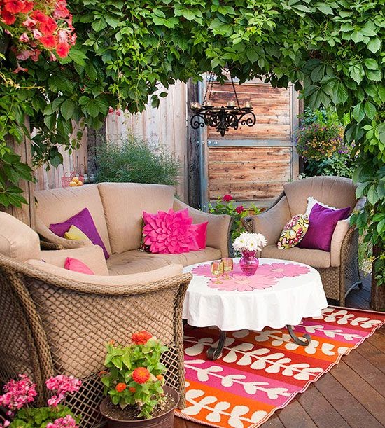
| Found on Pinterest |
 |
| Glassy Baby |
 |
| Anthropologie |
 |
| Anthropologie |
The shade brings strength, purpose, and decision.
A former boyfriend once asked me what I would rather have for Christmas, a microwave or a garnet ring. While I was happy he saw I had a practical side, I am even happier that when I open my jewelry box, there is not a microwave in sight.
 |
| Found on Pinterest |
Living in Color,
Renee
P.S. Don't for get to find us on Facebook and check out my new Pinterest board ~ Meet Marsala~ Pantone's 2015 Color of the Year.


.png)


.png)

.png)
.png)
.png)