Showing posts with label Better Homes & Gardens. Show all posts

Tuesday, February 24, 2015

Tips for choosing the RIGHT paint color!

With the hundred's of thousands of paint colors out there, you may wonder where to begin. And, if you are like many of my clients, picking a paint color may stop you in your tracks! How does one choose?

Instead of looking at as choosing just one color, I like to have a vision for the whole room and sometimes for the whole floor, depending on the layout of the home! Think of yourself as an artist, choosing your palette.

1. Don't pick your paint color first: I know that may seem counter intuitive, but trust me, it'll be easier to choose the right paint color to match your furniture than to find furniture to match your wall color!


Surely you have an idea of colors you like. What was your favorite color as a child? Do you still love that same color? What colors do you wear most often? Are they colors you could see yourself decorating your home with? 

Still not sure? Try creating a Pinterest board or Ideabook on Houzz, with images of rooms or paint color swatches that you like. What are the colors that are most prevalent? Click here to see my "No Fail Color Choices" board on Pinterest.

2. Find something that inspires you: It's always a good idea to start designing your room around one piece that you already love. It could be a pillow, a rug or maybe a favorite piece of artwork. I designed a whole room around this Octopus fabric! I just fell in love when I saw it! Whatever your inspiration piece may be, use that as springboard in choosing your room colors!

I loved this piece of artwork and decided to use it in one of the Maine cottages I was designing at the time. We stepped away from the traditional seaside color choices and decided to give this cottage a bit of a spunky feel incorporating unexpected pops of orange with beautiful blues.

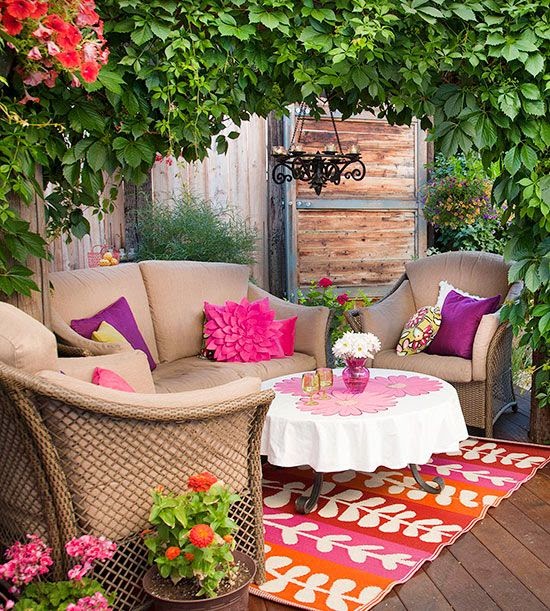
Room designed by Mandeville Canyon Designs
Here's another great example of how this designer used the colors in this hallway rug to add a fun paint color to the door.

Found on www.houseofturquoise.com

3. Try before you buy: Thank goodness you can buy test size paint colors these days! I always recommend that you purchase one of these so you can paint a small area of your wall and really see how it looks against your décor and as the light changes throughout the day. You will be happy you only bought a small amount if your paint happens to be the wrong shade!

4. Consider a color theme throughout your home: This is especially true if you have rooms that open up to each other or if you have an open-concept type home. I'm not saying everything has to be the same color, but there should be some sort of cohesiveness from room to room.
 
5. If you're still stumped, hire a designer: Sometimes it just takes another set of eyes to look at something and tell you "yes" you are headed in the right direction, or "maybe there's an even better color out there". Either way, interior designers have the education and expertise to help you make the best choice.

Just for fun click here and take Better Homes and Garden's color personality quiz. You just might surprise yourself and learn that your favorite color to decorate with is quite different than how you'd answer the question, "What's your favorite color?"

Best,

Renee Carman


Tuesday, October 14, 2014

Color Cravings ~ Think Pink


So, I have a confession to make....I have been craving Pink. For weeks now.

http://ladoole.tumblr.com/I know with Breast Cancer Awareness Month this October my heart and mind have been on my extraordinary friends, and their mothers, daughters, sisters, aunts and nieces who redefine bravery for all of us on a daily basis. 

What is this color that stands as the visual image of their battle, their triumph, and their strength? And is it possible for us to need a color in our lives to represent our being? Our own personal battles and triumphs? Just a little something to put in our pocket as a reminder that, "We can".

 Photo credit Apartment Therapy

As it turns our Pink is the perfect companion.

A combination of the take action primary of Red and the potential for achieving success and focus of White, it's no surprise that pink allows us to see our path and helps us to set on it's journey  as well.

Pink is tender and affectionate, romantic and playful. The hotter the color the hotter the passion. 


Benjamin Moore's Smashing Pink
And pink is the color of hope. Warm and comforting, it gives us the sense that there is in fact a tomorrow. Pink is used in rooms to help calm aggression and bring a sense of peace and tranquility to a space.

Oddly enough it is heavily associated with the feminine, unlike blue. Yet, it is the easiest tone on the skin and marries well with almost every complexion. And while it's perfectly at home standing on it's own, Pink is comfortable with almost any other color from grays, to browns, black, greens and it's standby favorite~orange.


So, if this color is so universally helpful and filled with feel good attributes, why then is it one of the least used colors in design? Some of it is the strong feminine connotations (which might be all the more reason to inject it into all situations), to the mystery of how to make it work.

Here's a guide to slipping this guaranteed smile making color into your daily life. 

Warning: Small doses of this intoxicating pigment could lead to long term or permanent inclusion into one's closet, home and office. Use at your own risk...

~How about getting stoned.
Rose Quartz is the stone of the heart, acceptance and unconditional love. Pop one in your pocket or set out a glass jar filled with these beauties to remind yourself that you are loved and give that gift freely.


photo credit from Better Homes and Gardens
~Accessories with attitude.
 Whether a hint of pink or all out fuschia this color will catch the eye and warm the soul. When the eye sees something that pleases it the dilation sends all sorts of feel good chemicals to the brain. 
Pink clothing makes everyone look good, regardless of the skin tone. 


~ Take a seat. 
There is something just imagination provoking about a pink chair or chaise. A spot for a romantic read or magical storybook at bedtime.  Most any fabric will do. And pink is very forgiving about DIY projects, so feel free to reuse an old Louis chair or metal barstool and practice your spray painting skills. Add a fabulous fabric and you are well on your way to abandon bliss.

Photo from Notonthehighstreet.com

Photo Credit from Apartment Therapy


~Advanced therapy. 
My second confession is that I have always yearned for an orange and pink dining room. I am hopeful, but practical. Dining rooms, powder rooms, and bedrooms are all willing subjects for a bold palette. Start with one wall and see where your imagination takes you. 


photo credit from Interior Design Pro


Photo credit from Domainehome.com


And if you are game for the above mentioned dining room, call me.....I'm waiting.

I always tell my kids if it's not immoral, illegal, or socially irresponsible, try to say, "Yes". 

                              So goes it with Pink, I think.


Happy Decorating!

Best,

Renee

For more design inspiration, check out my pinterest board this week...


Tuesday, September 2, 2014

Tips for a stylish and functional Mudroom and Laundry

So, I have to admit my cleaning spree has continued into a second week, which for those that know me, realize this is a big deal. I have a small attention span for repeated tasks that seem to bring no lasting value, i.e; the kids just mess it up again.
We (read: my husband) has taken over the task of remodeling our mudroom/laundry room complete with tiling, barnwood shelving, and mega organizational items. This, I am convinced, will change our lives and certainly put us on the path to whole house organization, and at the very least has allowed us (again read: husband) to hone our formerly non-existent tiling skills.
I took the advise I would give my clients and made a list of: Must haves, Would Like to Have, and Dreams (this is where the indoor/outdoor shower complete with rainforest foliage fit it).
I figured it might be good to pass this list along and also take it as an opportunity to get it out of my head and onto paper!

 ~ Define the purpose. A mudroom is only as good as it's easiest entrance. The best laid mudrooms have become pantries because the kids had to pass easier entrances like the front door to get to them. Make sure this much needed room is attached to your garage or as close to the bus stop is geographically possible.


This bright and functional space is right off the garage. It practically requests you to hang up your coat and boots, especially if they color coordinate.

~A Place for Everything and Everything in it's Place. Your grandmother was on to something (and probably tired of picking up your stuff). Take an inventory of what you have and where it should go. Whenever we design a kitchen or bath, we have the client empty everything out before we design. They end up needed about a 1/3 less than they thought because it turns out stuff like the gardening tools don't need to be in the spice drawer.


This great system from Pottery Barn gives even the most hopeless of organizers a fighting chance!

~Everyone Accounted For? How many family members will be using the space? How much room do they need? Make sure you take into consideration that your 5 year old will someday be bigger than you (trust me it happens!) and a cute little bench now will have them eating their knees years to come. Plus the size of backpacks doubles from year to year.
Are there room for guests?
This dream mudroom from Peace Design respects both present and future company.

And don't forget the four footed friends. It's great to at least have a hook or two for our companions, but here are some fun ideas that are on my Dream List.


 Whether you just have a corner to devote or a room the size of a Manhattan apt (my current mudroom reno is the size of my first Manhattan apt), devoting some time to planning and organizing will keep you ahead of the clutter ahead.
There are some great inspirational ideas on both Houzz.com and Pinterest to help get you started on your own road to organizational paradise. Just click here to check out my inspirational board and get more fun tips! 


Happy Organizing!

Best,
Renee 


Tuesday, July 8, 2014

You asked, we answered!

Last week we asked our Facebook followers if there were any design questions they would like to see us answer in our blog post this week. One of our fans asked to learn how to decorate her mantle. So, here it goes!

The way I see it, your mantel is like a blank canvas. Depending on your style and your room design, the possibilities are endless! 

To be honest, sometimes the best way to learn is to scour décor magazines, Pinterest, and the like for inspiration. Try different things and see what works. I like to leave just enough room for flexibility on my mantel, so that I can change the design for the seasons. 

Here are some key principles I always like to follow when designing or re-designing a mantel.
  • Take everything off your current mantel
  • Find one large piece that you love and make that your centerpiece. It could be a piece of artwork or a beautiful mirror. In the case of your mantel, I think bigger is better. Do not hesitate to fill the wall space from mantel to ceiling.
  • Next, begin to add items of visual interest and weight. You want the eye to move around. This might mean adding candles of varying height, or something else, such as vases that are different sizes
  • Layer in some additional pieces, such as photos, flowers, or candles.
  • And finally, add some POP!! You know me...I love to add a surprise pop of color in my design work. The mantel is a great place to do just that!
Many mantels are not very big, or deep. This can add another challenge. In this case I'd recommend hanging your focal piece vs. leaning it. You may also want to hang some sconces to add interest and movement, without trying to squeeze it into place.
 

I loved this article from +Better Homes and Gardens because it shows mantels done in just about every style you can imagine! Take a look and see what fantastic ideas they've created. Click here to see the Better Homes & Gardens article.

Thank you for your question, and I hope that I was able to offer you some ideas and inspiration!

Good luck decorating your mantel!

Best,
Renee

P.S. Let me know if there are any other design dilemmas you'd like me to cover in my blog!

Tuesday, March 11, 2014

What does your favorite color say about you?

www.mandevillecanyondesigns.com
How many times have you been asked, "What's your favorite color?" My guess is that it's probably been quite a few times! And through the years your favorite color may have changed. As a child you may have loved the color pink or blue, but as you got older it changed to something else, like yellow or red. Why is that you wonder? Have you ever thought about what your favorite color says about you? It's really quite interesting and quite fun if you think about it!

Take a look in your closet. What color(s) do you see most repeated throughout your wardrobe? Does one certain color rise to the top of the heap? Are you colorful or very muted?

If you ask me what my favorite color is, I'd quickly respond with "red, of course!" It's the color I wear on the inside. I don't tend to decorate with it much, but it is my motivator! When it comes to decorating I lean more towards red's more playful and gregarious sister, orange!

So what does this say about me?

To find out what your favorite color says about you click here and you'll be taken to the I love color! Board on Pinterest.
When it comes to decorating are you a little bit more "color-phobic"? Or do you find yourself infusing you home with your favorite color too! Just for fun click here and take Better Homes and Garden's color personality quiz. You just might surprise yourself and learn that your favorite color to decorate with is quite different than what you'd answer the question, "What's your favorite color?" with. 

So often I hear people say that they are tired of decorating with the same old beige or off-white, but are too nervous or don't know how to add some "pops" of color without "overdoing" it, or without making an expensive mistake.

Fear no more! I am a certified Dewey Color System Design Consultant. Working together we can identify what colors are you "comfort colors". These are the hues that sooth and inspire you. From there we can mindfully select a paint, fabric and accessory color palette.

California Paints has an excellent section on their website about color theory and how colors make you feel. Take a look and see if the color of the room you are sitting in sets the mood you wanted to achieve. California Paints Color Theory.

Before I select a color for a client, I ask many questions so that I can understand how they want to feel in the room we are working on, serene in a bedroom, lively in a playroom, creative in the kitchen.

Don't be afraid of taking a walk on the wild side, or at least crossing the street to a new color scheme. And if you need someone to hold your hand and guide you through it, I'm here for you!

Colorfully yours,
Renee